2025
UX/UI design for an alerting platform that can save lives (UI, UX patterns, Userflows)
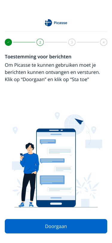
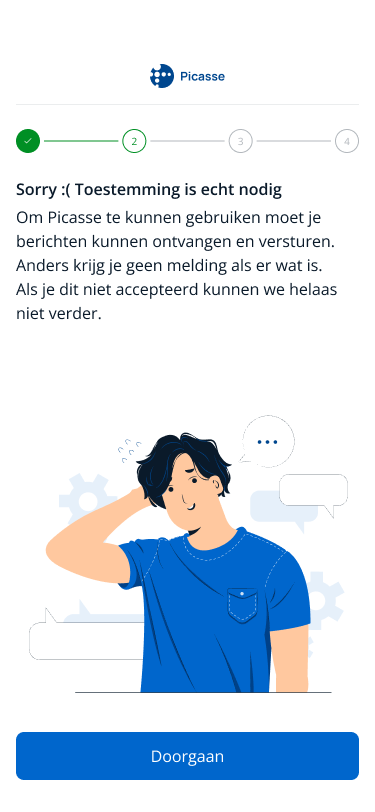
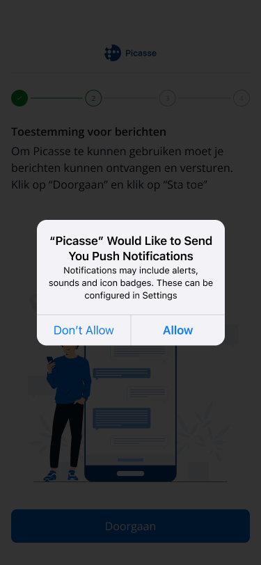
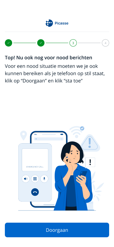
The challenge
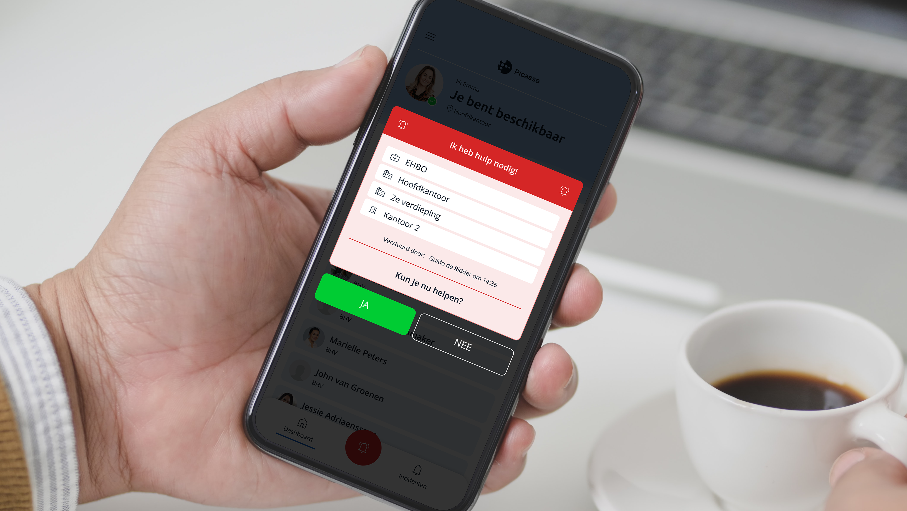
The Picasse app (known for BHV Alarmering) helps organizations communicate quickly and effectively with their emergency response teams during critical situations.
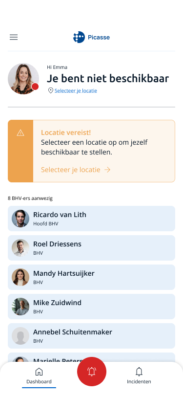
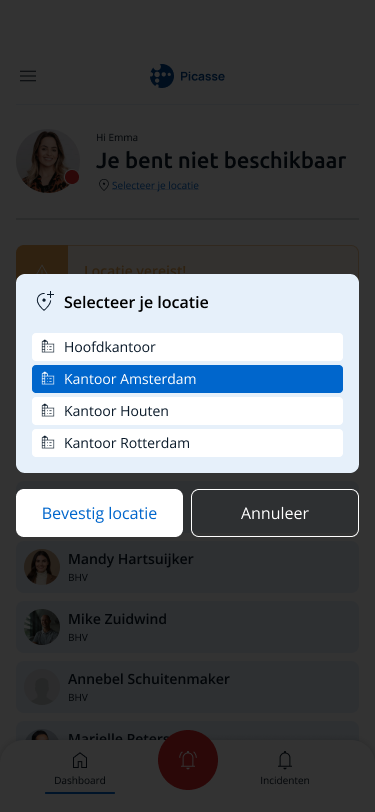
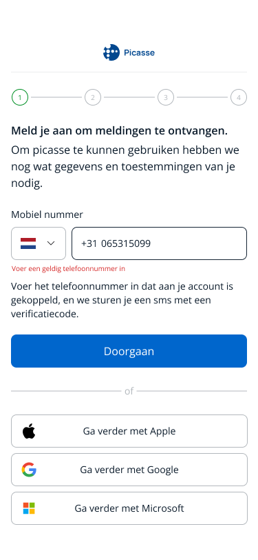
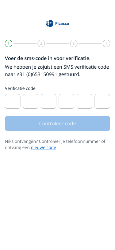
However, the registration process was overly complex, users struggled to complete it and often dropped out early. Clear error messages and feedback moments were missing, which made the experience frustrating. In addition, the interface was outdated and inconsistent across Android and iOS.
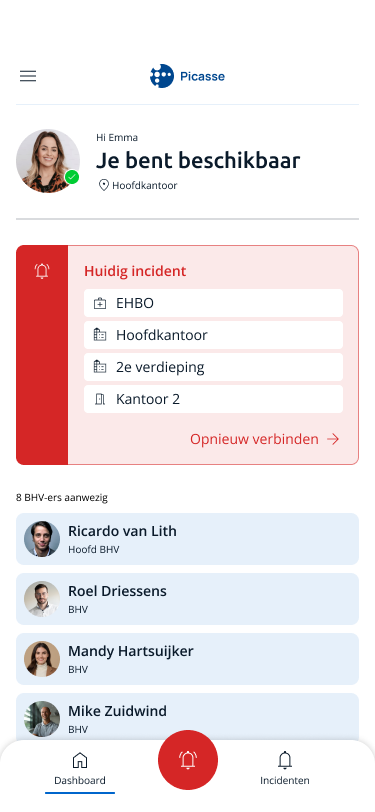
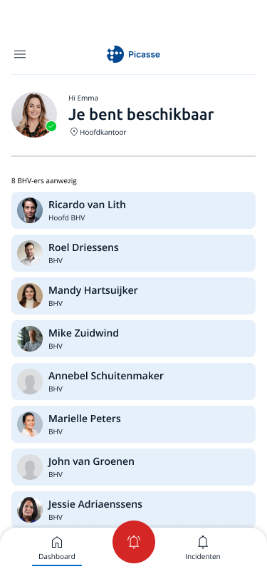
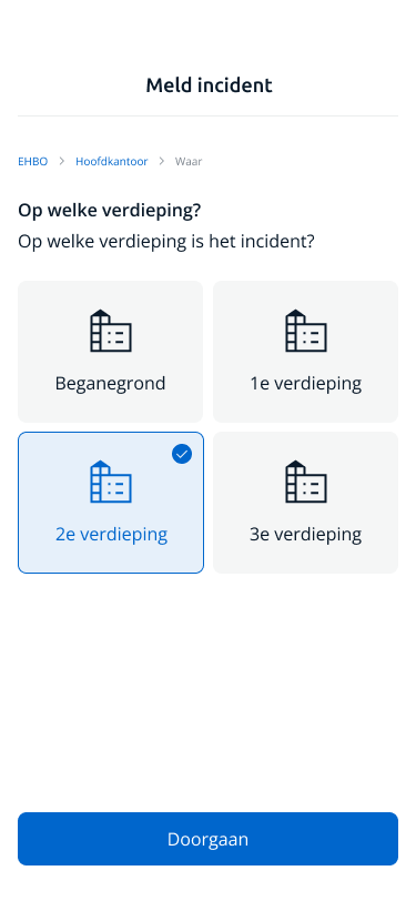
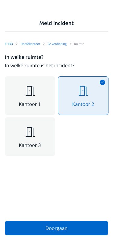
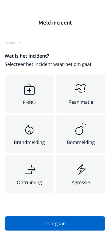
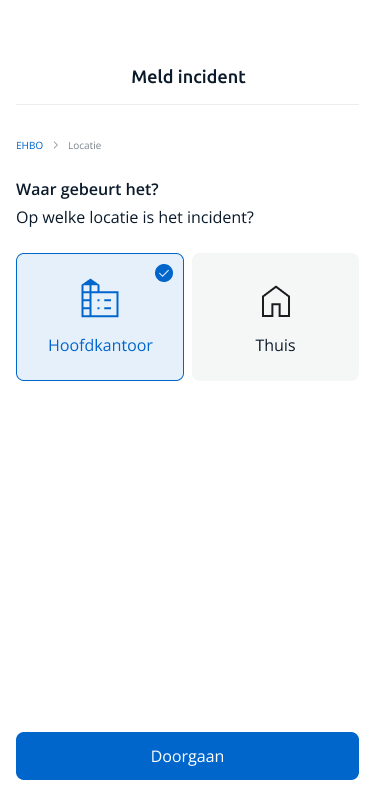
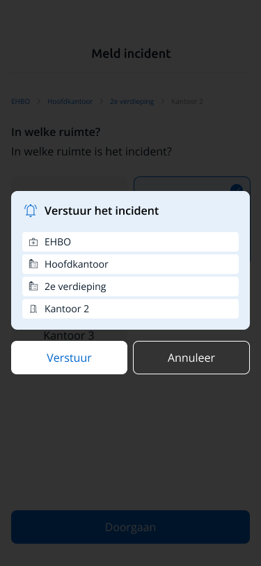
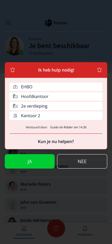
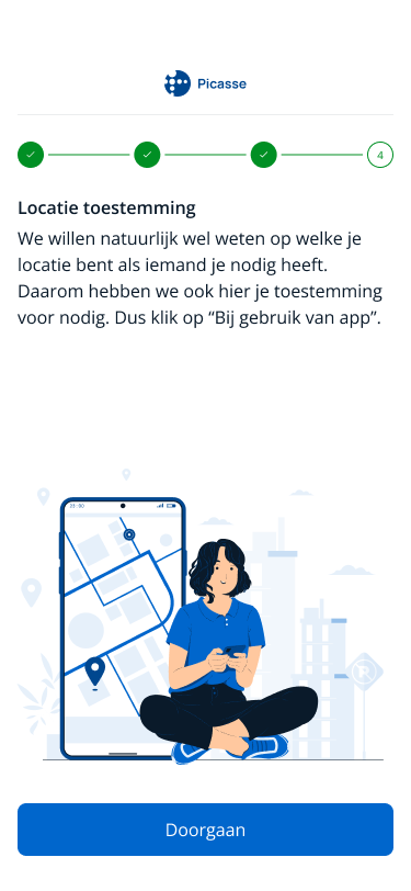
Another challenge was that organizations with multiple locations or buildings couldn’t always reach the right emergency responders during an incident, causing confusion in moments when clarity is crucial.
However, the registration process was overly complex, users struggled to complete it and often dropped out early. Clear error messages and feedback moments were missing, which made the experience frustrating. In addition, the interface was outdated and inconsistent across Android and iOS.
Another challenge was that organizations with multiple locations or buildings couldn’t always reach the right emergency responders during an incident, causing confusion in moments when clarity is crucial.
My role
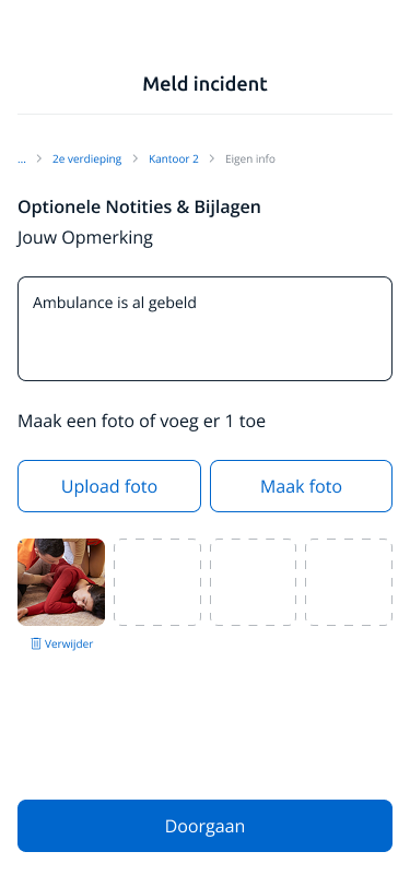
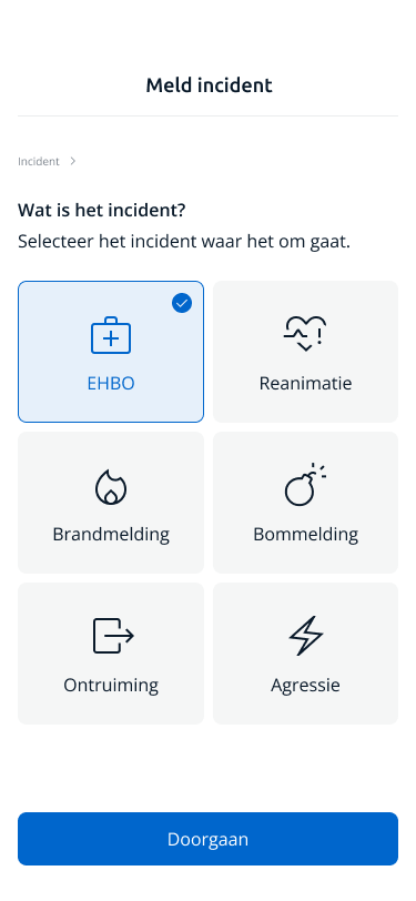
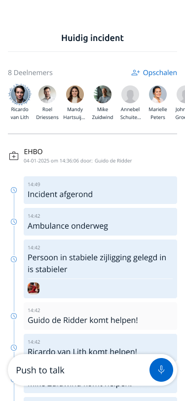
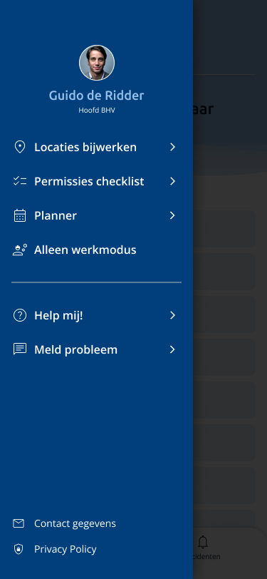
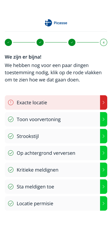
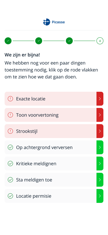
As a UX/UI designer, I redesigned the entire registration and alert process for both platforms. I simplified the user flow, added clear error messages and feedback, and made every step more intuitive.
I also refreshed the overall look and feel with a modern, accessible visual style that conveys urgency and reliability, key for an emergency alert app.
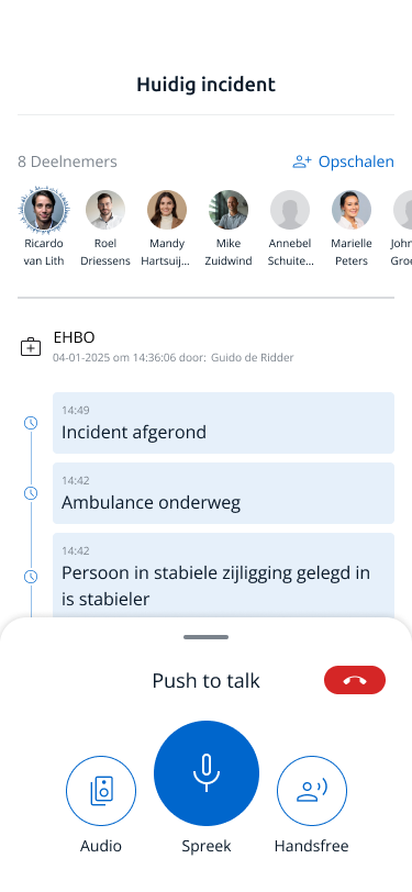
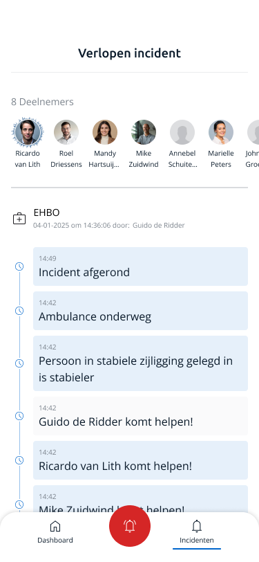
In addition, I introduced new functionalities such as video calling, a walkie-talkie mode, and the ability to escalate alerts to additional responders, while ensuring that organizations with multiple sites always notify the correct BHV teams.


The result
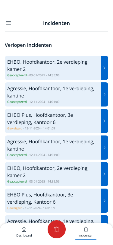
A clear, fast, and consistent process that guides users rather than hinders them. The app now feels reliable, professional, and user-friendly — exactly what’s needed in situations where every second counts.